This appendix introduces you to the design of the widgets framework through a series of simple examples.
The code here is written in Lean 3. If you wish to try out the code examples yourself, I recommend that you install Lean 3 and Microsoft Visual Studio Code -- henceforth referred to as VSCode. Any installation guide I place here runs the risk of becoming out of date, and so I refer the reader to the leanprover-community installation instructions.
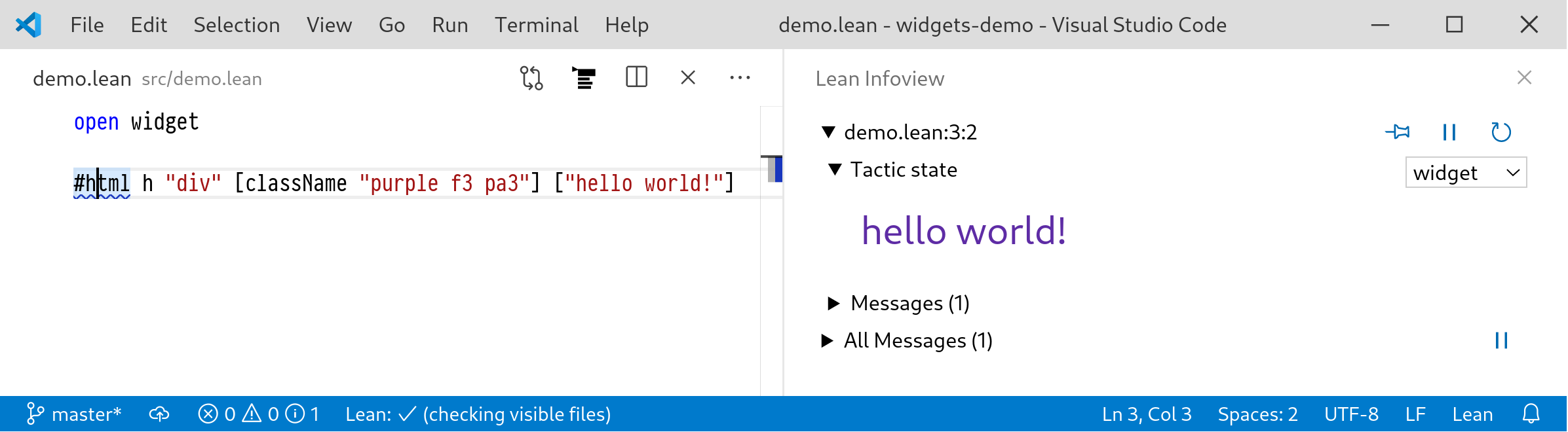
Making a widget is as simple as opening a Lean file in VSCode and adding the following snippet:
open widget#html "hello world!"
Clicking on #html will reveal the widget in the infoview panel.
The infoview is the output window for Lean, containing the goal state and messages from the Lean server. If you can't see it you can open it by clicking the display goal button  . If you can't see this button then you may need to install the Lean extension for VSCode, consult the community installation instructions for more information.
However the above example is scarcely more impressive than #print "hello world!", so let's start with:
#html h "div" [className "purple f3 pa3"] ["hello world!"]
This effectively generates the following HTML:
<div class="purple f3 pa3">hello world!</div>
which is then rendered in the infoview:
A hello world widget.
h is a shorthand alias to create a new HTML element.
The mysterious "purple f3 pa3" string is a set of CSS class identifiers. The infoview client comes with a stylesheet called Tachyons that watches for these identifiers and uses them to change the appearance of the div. The codes can appear cryptically terse but one gets used to them; "f3" means 'use font size 3' and "pa3" means 'add some padding'.
We can view the type signature of h:
#check @h-- h : Π {α : Type}, string → list (attr α) → list (html α) → html α
The type parameter α is called the action type. It is the type of the data that will be returned when the user interacts with the interface in some way. To see this, consider this example with a button;
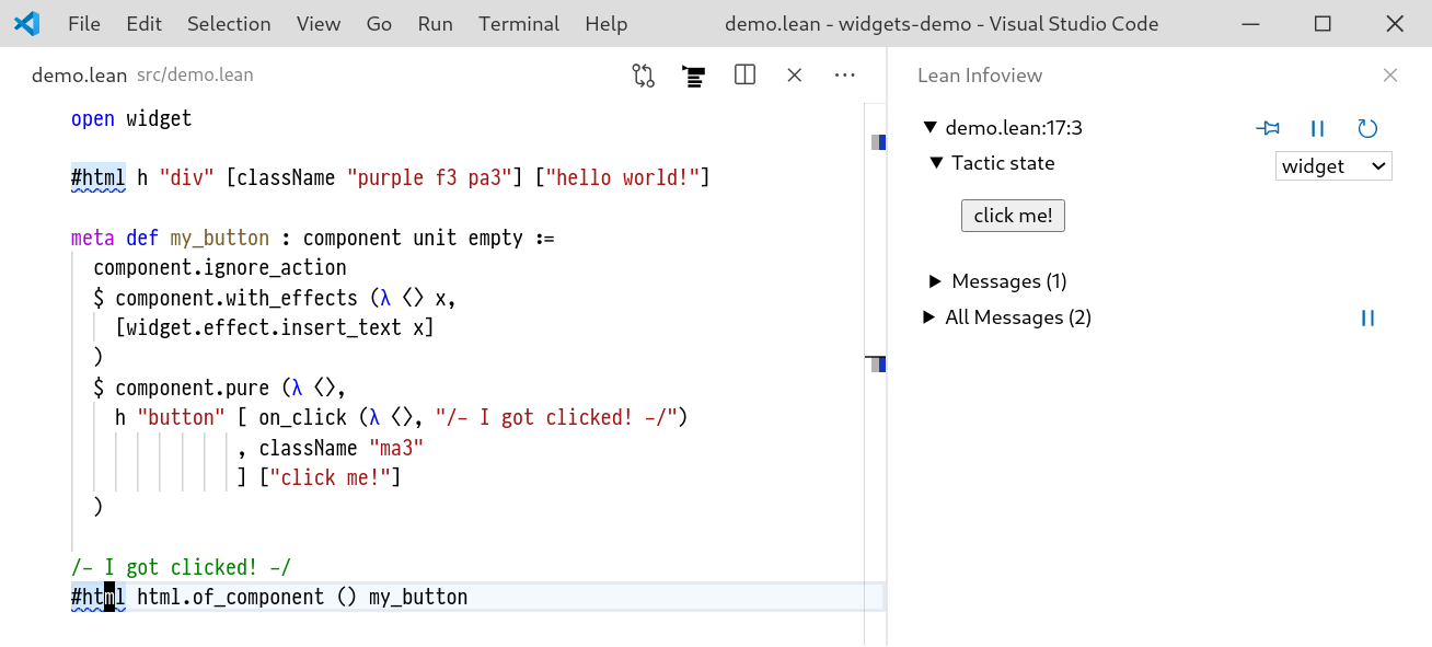
h "button" [on_click (λ _, "I got clicked!")] ["click me!"]
on_click : (unit → α) → α is called an event handler and allows the widget writer to specify an action to be emitted when the given button is clicked. However in order to have this action do something, we need to connect it to a component:
meta def my_button : component unit empty :=component.ignore_action$ component.with_effects (λ ⟨⟩ x,[widget.effect.insert_text x])$ component.pure (λ ⟨⟩,h "button" [ on_click (λ ⟨⟩, "/- I got clicked! -/"), className "ma3"] ["click me!"])#html html.of_component () my_button
Clicking the resulting button causes the text "/- I got clicked! -/" to be inserted on a new line above the cursor.
Window state after clicking the button.
So how does this work?
components are responsible for handling all of the non-pure aspects of widgets. That is, statefulness and side-effects.
I will discuss state later, in the above example we can see an example of a side-effect.
Let us write π ⇨ α to mean component π α.
The first part of the above definition uses component.pure:
component.pure : (Props → list (html Action)) → (Props ⇨ Action)
This creates a 'pure' component that takes a view function mapping Props (in our example Props = unit) to a list of html elements, in our case a single button with action type string.
The next component in the list tells us what to do in the event of an action
component.with_effects :(Props → Action → list effect)→ (Props ⇨ Action) → (Props ⇨ Action)
Here, effect is a built-in datatype used to represent the side effects that widgets offer. effect.alert : string → effect indicates that the client app should display an alert message to the user. Other effects include copying a string to the clipboard or inserting some text in the current Lean file. The function passed to with_effects is called whenever the user causes an action to occur and the effects in the returned list are executed by the client in the order they appear.
Finally, component.ignore_action : (Props ⇨ Action) → (Props ⇨ empty) throws away all actions that might by emitted by the inner component.
B.0.1. Statefulness
The final piece of the puzzle is statefulness, most apps require some concept of local state. For example:
the position in a scrollable panel
the open/closed state of a collapsible panel
These are all parts of the state which matter for the UI, rather than data-centric states. There might also be some state that should be reflected in the data, such as the state of a document. This is not what a stateful component is for.
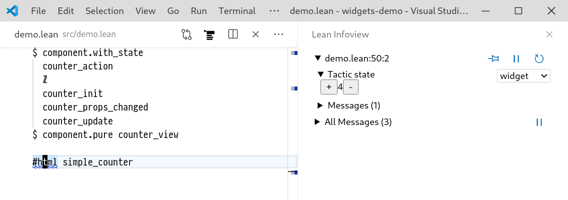
A simple counter component is given below.
open widgetvariables {π α : Type}inductive counter_action| increment| decrementopen counter_actionmeta def counter_init : π → ℤ| _ := 0meta def counter_props_changed : π → π → ℤ → ℤ| _ _ i := imeta def counter_update : π → ℤ → counter_action → ℤ × option α| _ i increment := (i + 1, none)| _ i decrement := (i - 1, none)meta def counter_view : (ℤ × π) → list (html counter_action)| (i, _) :=h "div" [] [h "button" [on_click (λ ⟨⟩, increment) ] ["+"],html.of_string $ to_string $ i,h "button" [on_click (λ ⟨⟩, decrement)] ["-"]]meta def simple_counter : component π α :=component.with_statecounter_actionℤcounter_initcounter_props_changedcounter_update$ component.pure counter_view#html simple_counter
The counter widget.
Let's unpack what this is doing. The main things to focus on are the arguments to with_state:
component.with_state(InnerAction State : Type)(init : Props → State)(props_changed : Props → Props → State → State)(update : Props → State → InnerAction → State × option Action): ((State × Props) ⇨ InnerAction) → (Props ⇨ Action)
The essential idea is to maintain a local state s that wraps the inner component c : (State × Props) ⇨ InnerAction.
The other arguments dictate how this state should be initialised and mutate over the lifecycle of the component.
init pprovides the initial value ofsgiven propsp.props_changed p₀ p₁ s₀gives the system a chance to update the state if the props of the component change fromp₀top₁.update p s aupdates the state in the event that the inner componentcemits an actiona. It may optionally return its own action that should be emitted by the outer component.
So in the case of the counter above, the Props type π is ignored.
The State type is an integer and the InnerAction is counter_action, whose values are either 'increment' or 'decrement'.
init produces the initial counter value 0. props_changed just keeps the state the same.
counter_update increments or decrements the state depending on the value of the given counter_action.
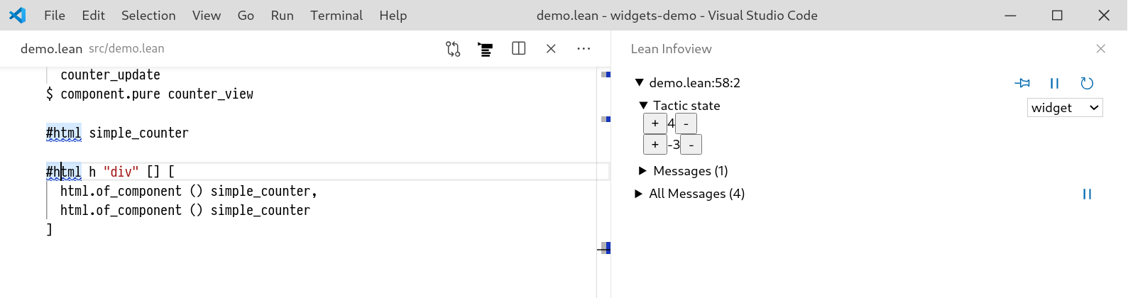
Note that the state is local to an individual counter, so for example we can write
#html h "div" [] [html.of_component () simple_counter,html.of_component () simple_counter]
and the ProofWidgets framework will automatically track an independent state for the two different counters, even when more components are added or taken away.
The ProofWidgets system does this by assigning each component an identity and then holding a persistent, mutating state for each of these components.
Multiple counters with independent state.
Even when there is no need for state, components serve an important role of avoiding recomputing unchanged parts of the widget tree. This is done with component.with_should_update.
component.with_should_update(comp : Props → Props → bool): (Props ⇨ Action) → (Props ⇨ Action)
Every time the component is recomputed, as for example in a view method, the given comp function is used to compare the previous value for Props with the new value.
If it returns false, then the widgets rendering system does not re-render the inner component and instead uses the cached value.